Colour palette
Colour palette creation
As per the brief, in the spirit of Josef Albers, I’ve created some colour palettes derived from the environment taken from some photos I have in my collection. I’ve tried to be quite varied in the tone of colour and selected one shot from winter, one from spring and one final shot from summer to experiment with how this influences the colours and their relationships.
Early morning (winter)
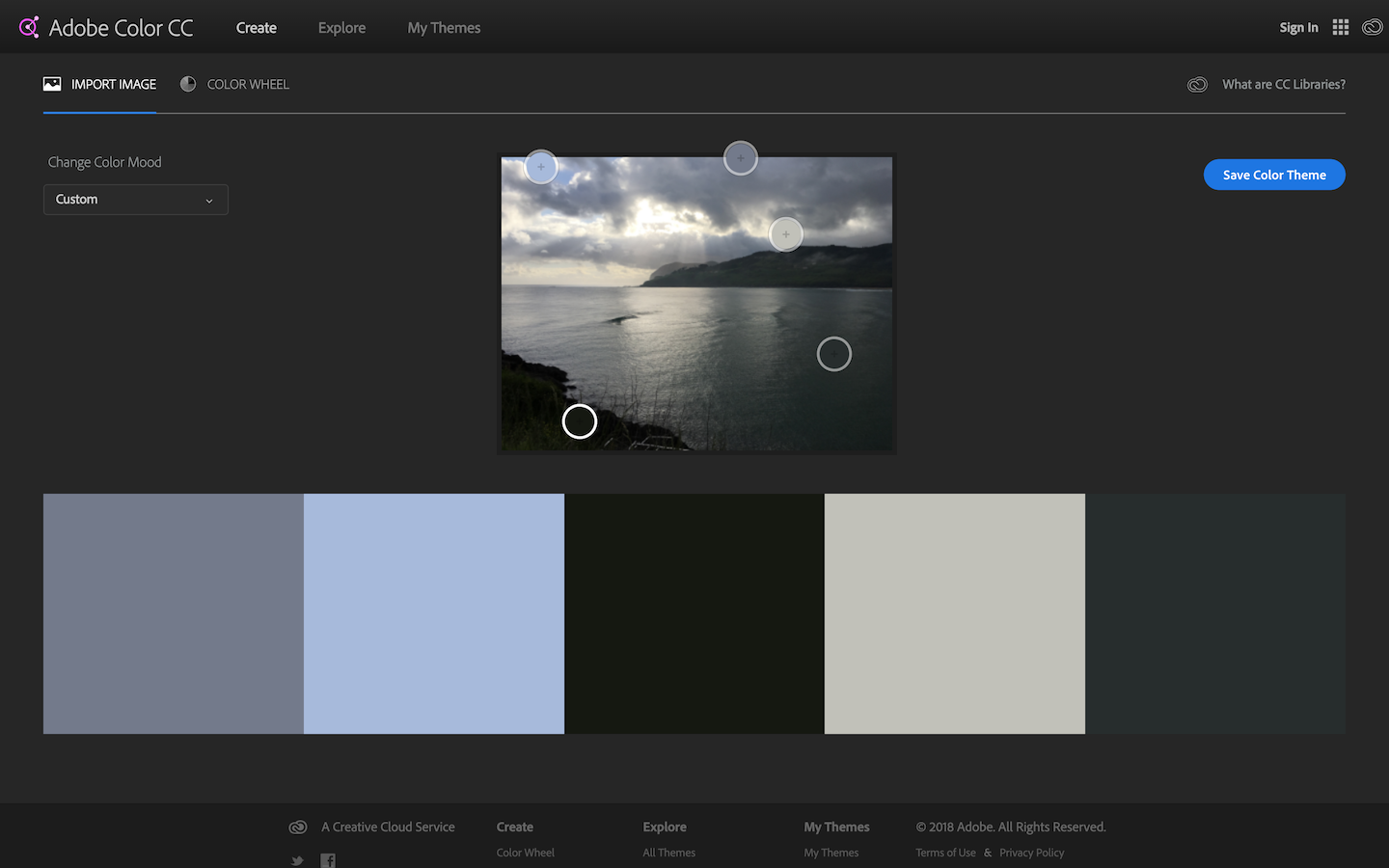
Due to the time of year and the time of day there is very little vibrance to the colours in this shot. The blue second from the left is the closest thing we have to a dominant colour but I’d say it’s too neutral a blue to be a tertiary colour, I would suggest this is most likely the accent colour too.
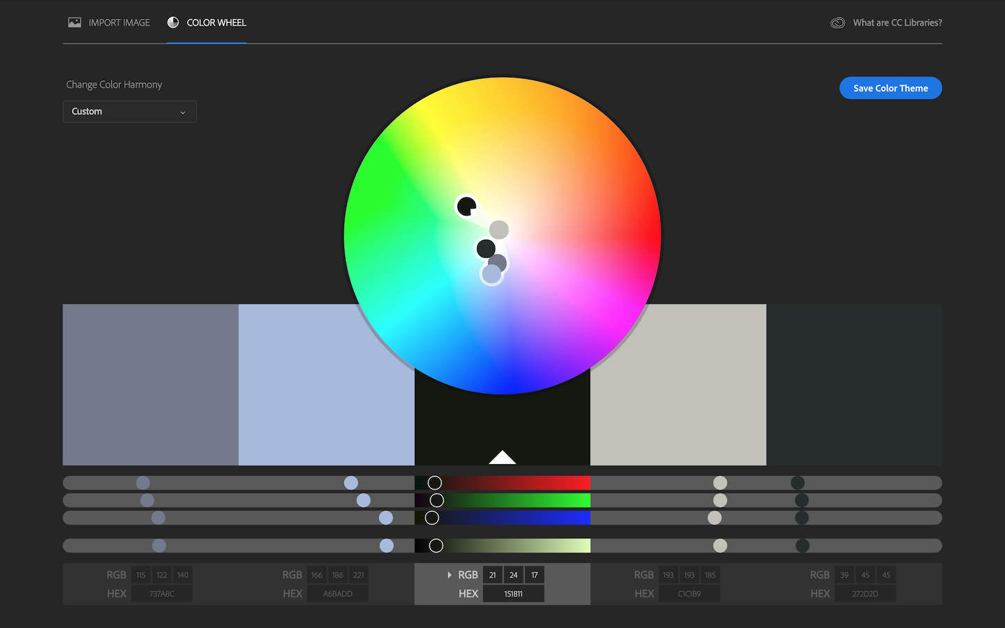
Due to the selection being so neutral it’s harder to identify the clear relationships between the colours, however I would say that the darker blue grey first from the left and the yellow grey second from the right are complimentary and the blue second from the left and the yellow grey second from the right are near complimentary. Given the time of day / year, all the colours are low on the chroma scale.
Early morning (spring)
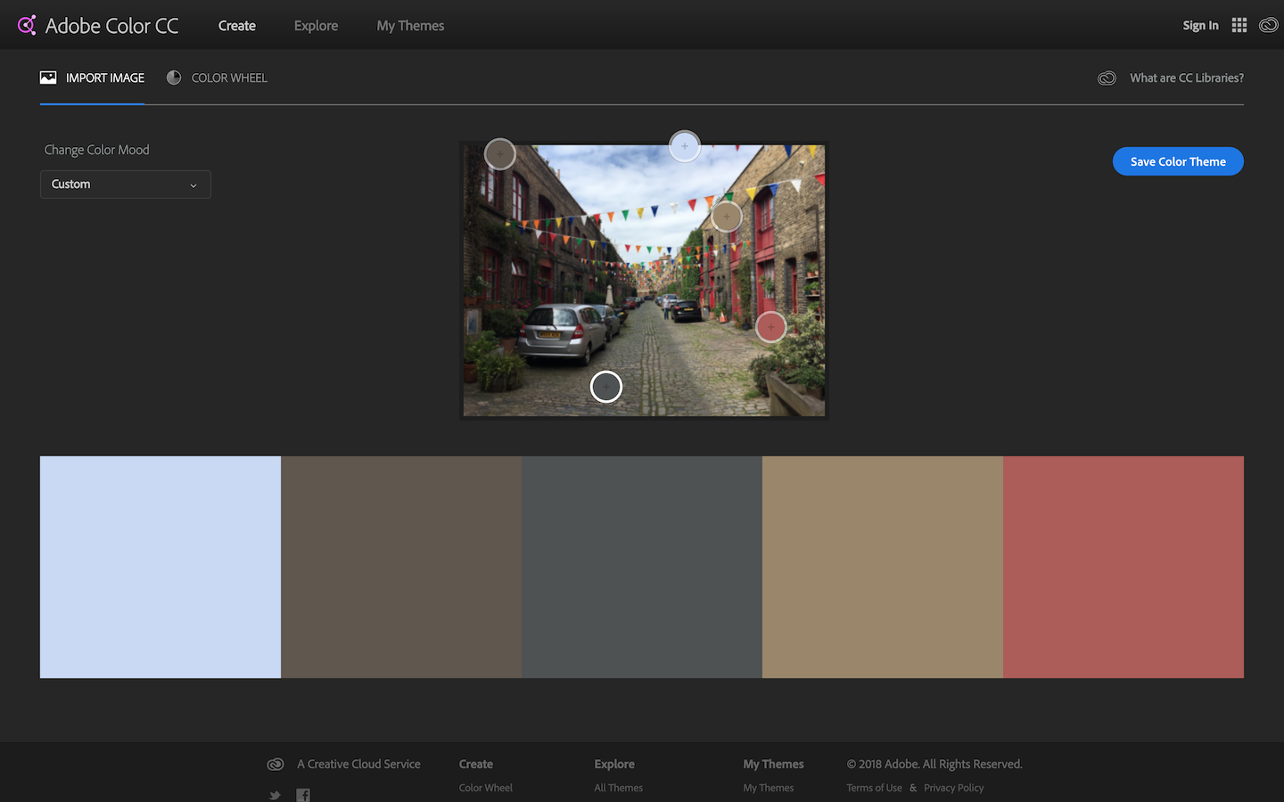
Being spring there is a touch more vibrance in the colours in this shot. The red on the far right is the most dominant being near tertiary, the blue on the left clearly stands out being the lightest but I’d say it lacks the boldness required to be the accent colour.
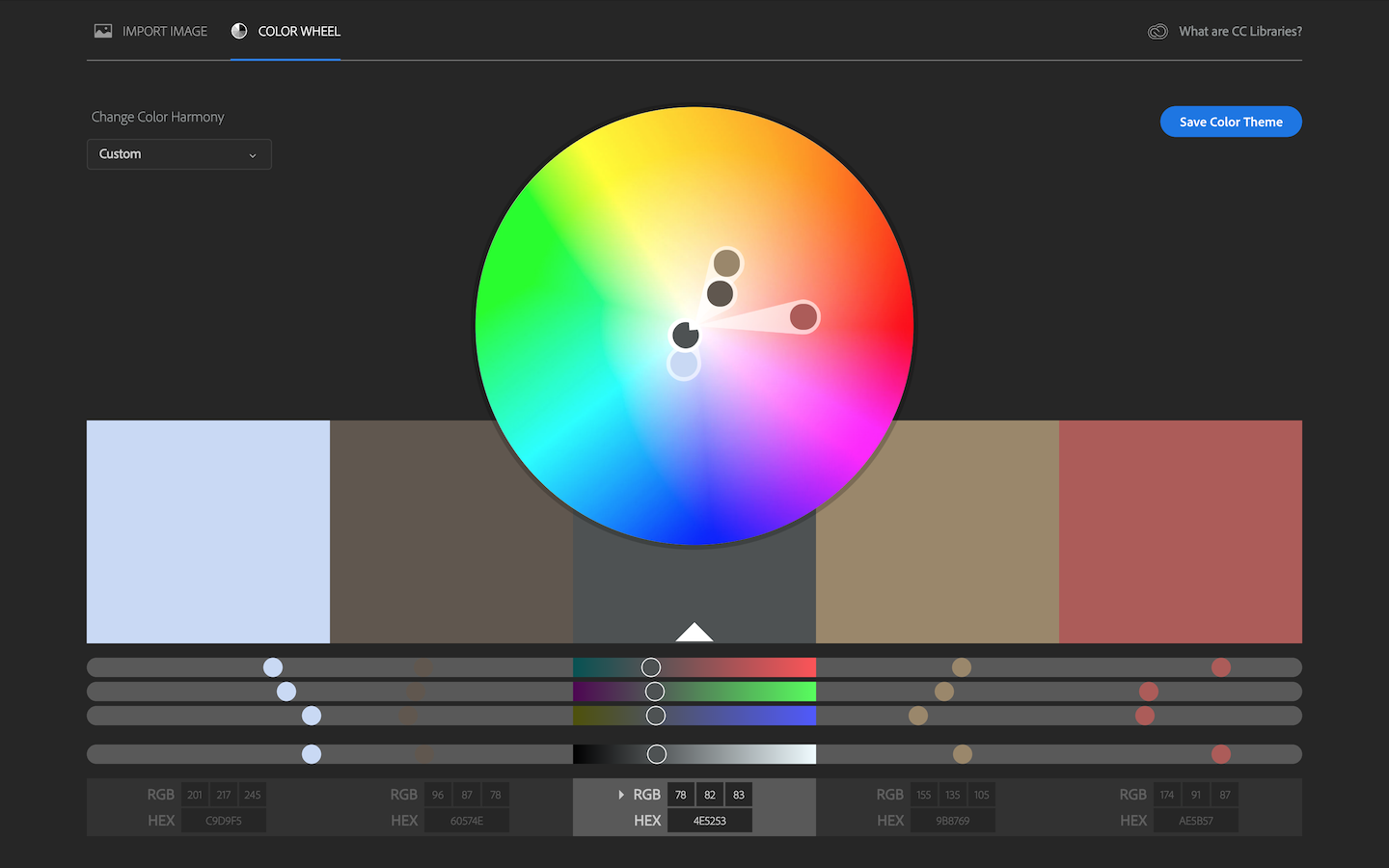
Despite being slightly more vibrant than the winter colours, all but the red are still low on the chroma scale. The blue on the far left is near complimentary to both the brown second from the left and darker beige second from the right.
Afternoon (summer)
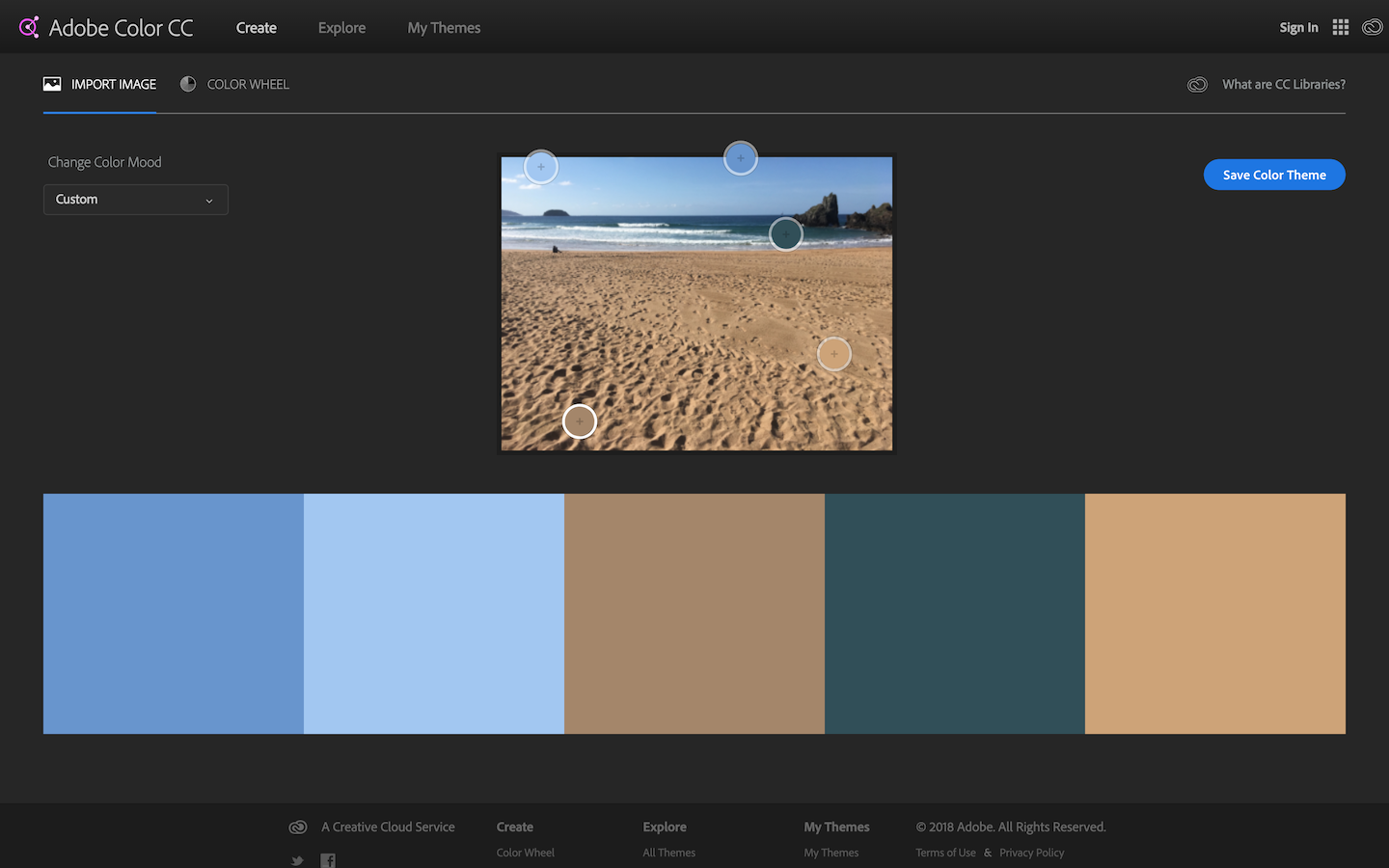
Being a clear day in summer the colours in this shot are clearly more bold. The yellow / orange sand colour on the far right is the most dominant being near tertiary but it’s in definite competition with the blue on the left. Being all of the colours are quite bold and in contrast to one another it’s harder to pick an accent but I think that the darker turquoise blue second from the right is the most likely candidate.
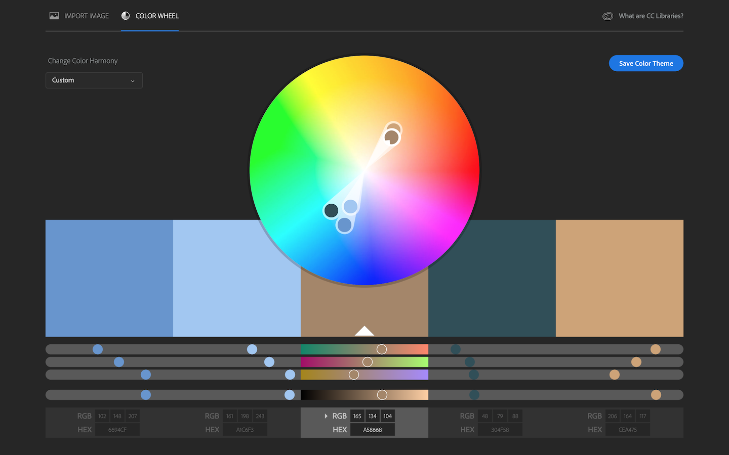
This time the colours are all either complimentary or near complimentary, and all are higher on the chroma scale, and with exception of the lighter blue all are of around the same saturation.