Photo bashing
In this post I’m going to experiment with some of the techniques given in the Introduction to Digital Painting video by Phoebe Herring coupled with some techniques I’ve already learned working as a designer to create some artwork for the following screens to be used in Escape The App:
- Countdown to starting a game: Shown when an escape game is selected for game play.
- New clue available: Shown during gameplay when a new clue is available.
- Confirm take clue: Shown to seek confirmation from the user when taking a clue.
- Confirm quit game: Shown to seek confirmation from the user when quitting a game.
- Successfully completing a game: Shown to the user when they complete a game within the time limit.
- Failing to complete a game: Shown to the user when they fail to complete a game within the time limit.
My technique
My starting point is to find some backgrounds that suit my narrative. A quick brainstorm around historical revolutions, underground movements and escape games masters brings me to disused factory buildings and control rooms. Next I’m going to apply some filters. My years of experience working with Photoshop to artwork images for print media have taught me a few things about filters; primarily that they are very powerful tools that can be used to create some very cool effects but that overuse or misuse can easily result in very amateur looking artwork. To avoid this in my artwork for Escape The App I want to have a clear vision of what the artwork should look like before getting my hands dirty with the filters. I really like the work of Phoebe Herring, her style is fantastically polished and it lends itself perfectly to concept art, however the art I want to create is different.
Escape The App paints our modern world to be a dystopia created by us being slaves to our devices. Escape is the abandoned movement formed by the government that is now driven by the public. Being Escape is now an underground movement I want to draw inspiration from the art historically associated with movements or revolutions. The most prominent of course being the posterised propaganda art that is synonymous with The Cuban Revolution and war time poster art. I’ve added a few examples below:
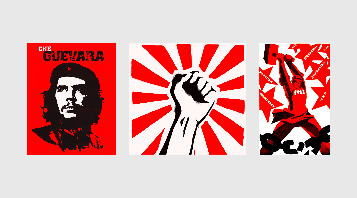
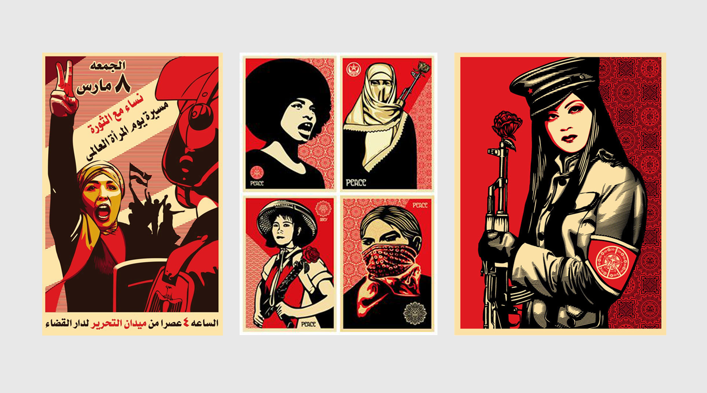
You can see here that in all cases that the art is highly posterised, there is minimal use of colour (usually just three colours) and the associated colours are often red, white and black. The US based artist Shepard Fairey has modelled a very successful career on utilising his own modern vector based approach to creating this type of art to deliver profound modern propaganda and his art has also been used decoratively by big name clients including Led Zeppelin. I’ve added a few examples of his art below:
What I want to try and do is to find a series of techniques in Photoshop that I can utilise together to quickly create art that is stylistically similar to the above posterised examples but having a more painted look influenced by the work of Phoebe Herring. The following is the approach I’ve taken to achieve this:
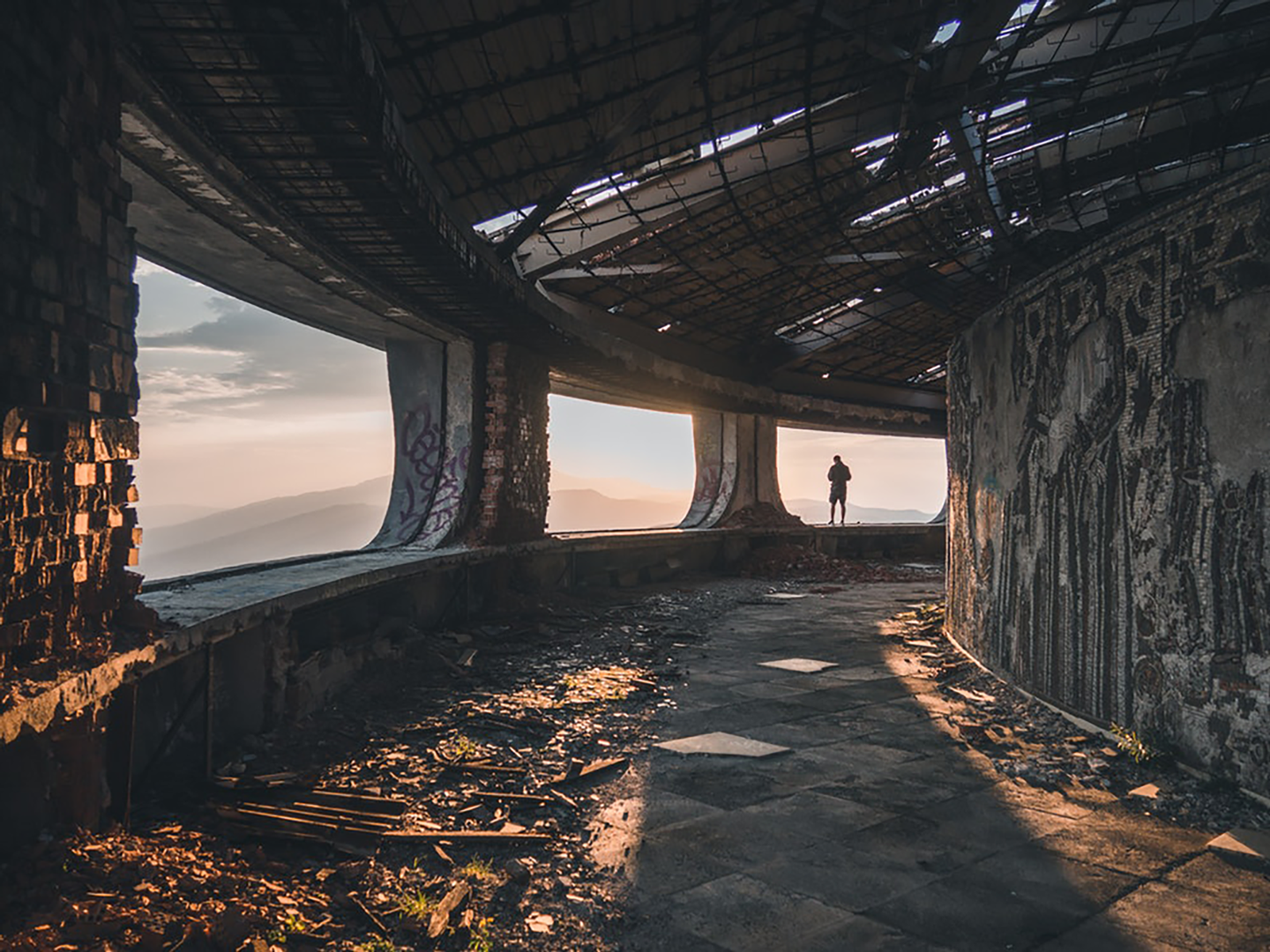
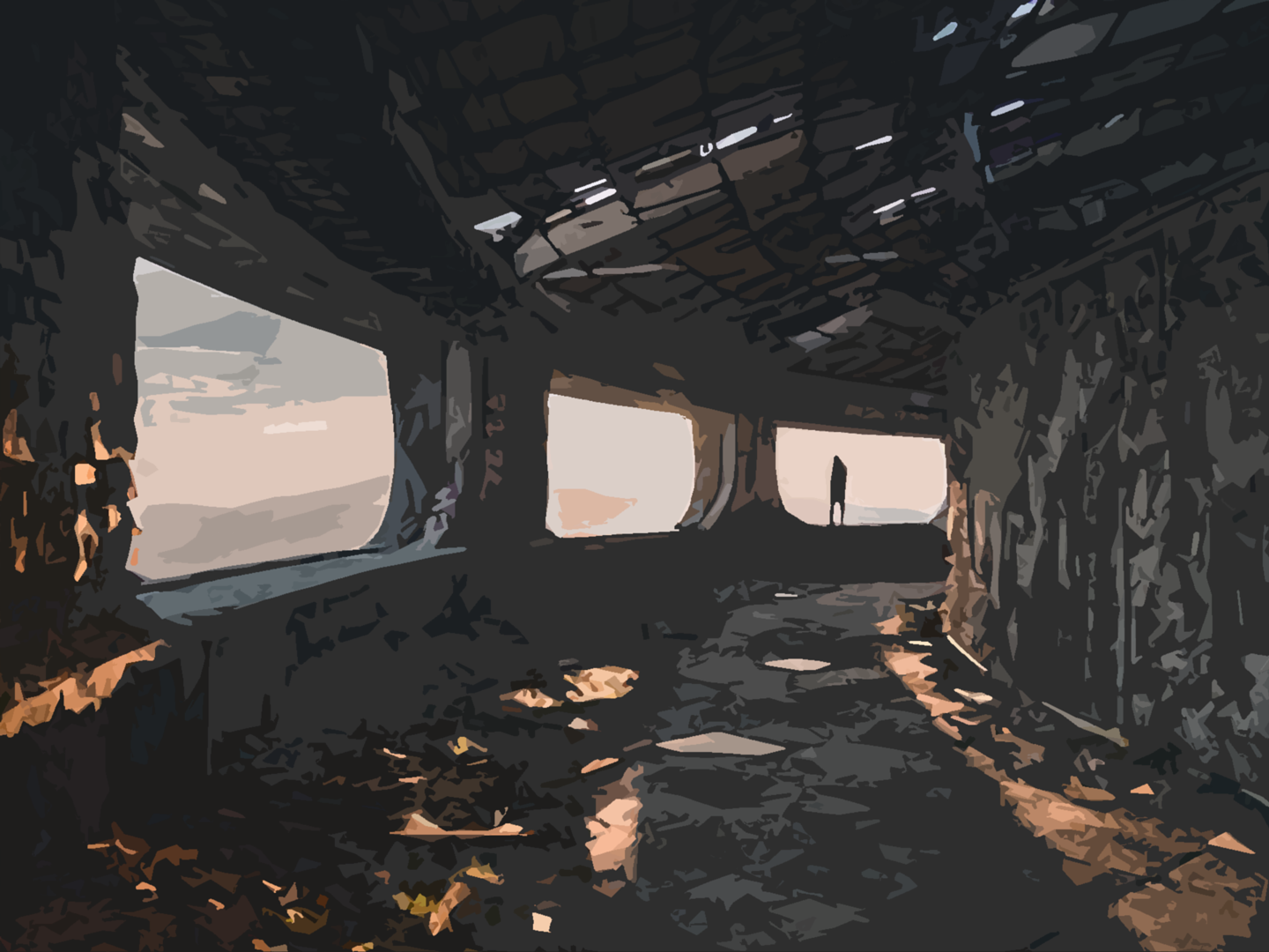
The raw image
This was my starting point, it’s an image taken from a Google search for disused factory buildings. Despite being dilapidated the form of the architecture is quite futuristic and has a dystopian look about it. With a 360 degree lookout through the big bay windows, I imagined this to be somewhere that the headquarters for an underground movement might be found.
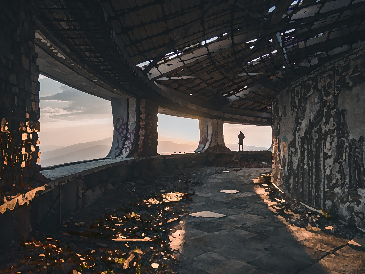
Applying a Dry Brush filter
I applied an artistic dry brush filter to this and tweaked the levels on the filter to achieve a believable painted effect similar to the look and feel of Phoebe Herring’s work.
Filters > Artistic > Dry Brush > (brush size: 2, brush detail: 8, texture: 1)
Applying a Cutout filter
I applied an artistic cutout filter to this and tweaked the levels on the filter to achieve distinct colour separation and move the image toward the look of a vectorised illustration.
Filters > Artistic > Cutout > (number of levels: 8, edge simplicity: 4, edge fidelity: 2)
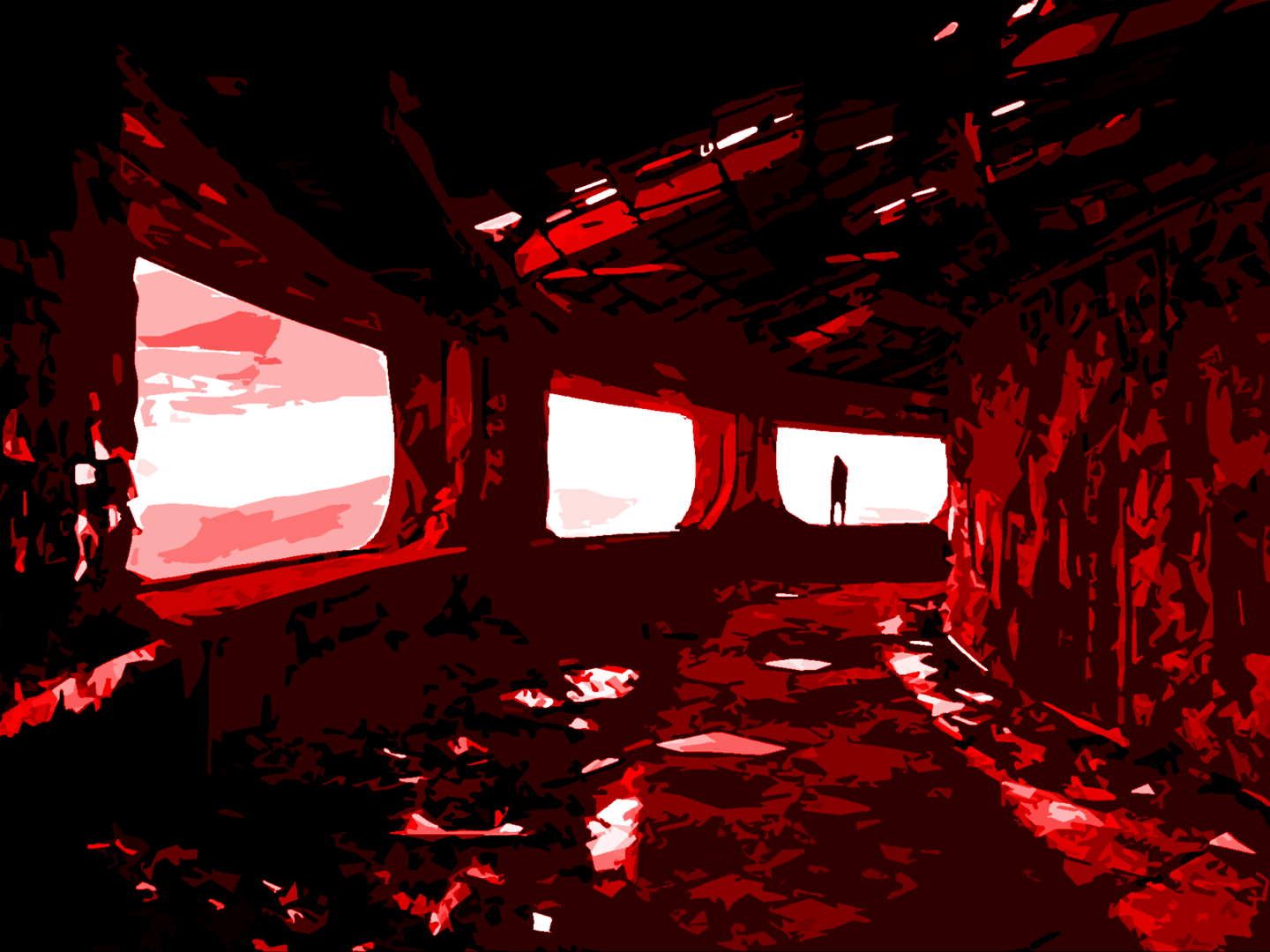
Applying adjustment layers
I applied a saturation adjustment layer to completely desaturate the image, I then applied a red colour fill that I set to use the overlay blend mode and finally I applied a levels adjustment layer to bring out the white and black to create more contrast and complete the vectorised look I was after.
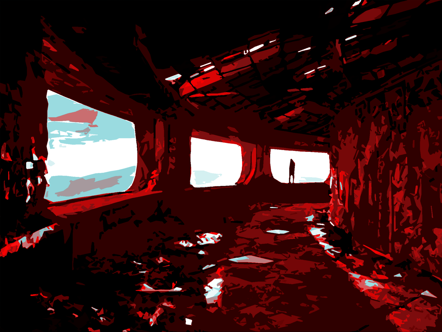
Introducing the third colour
I introduced the blue from my colour palette to round off the image treatment. I did this by selecting a colour range sampling a lighter pink / white colour from the previous image to isolate the highlights. I then coloured the selection with the blue and applied the hue blend mode to the blue layer so that the blue colour only affects areas with colour and the white areas remain almost untouched.
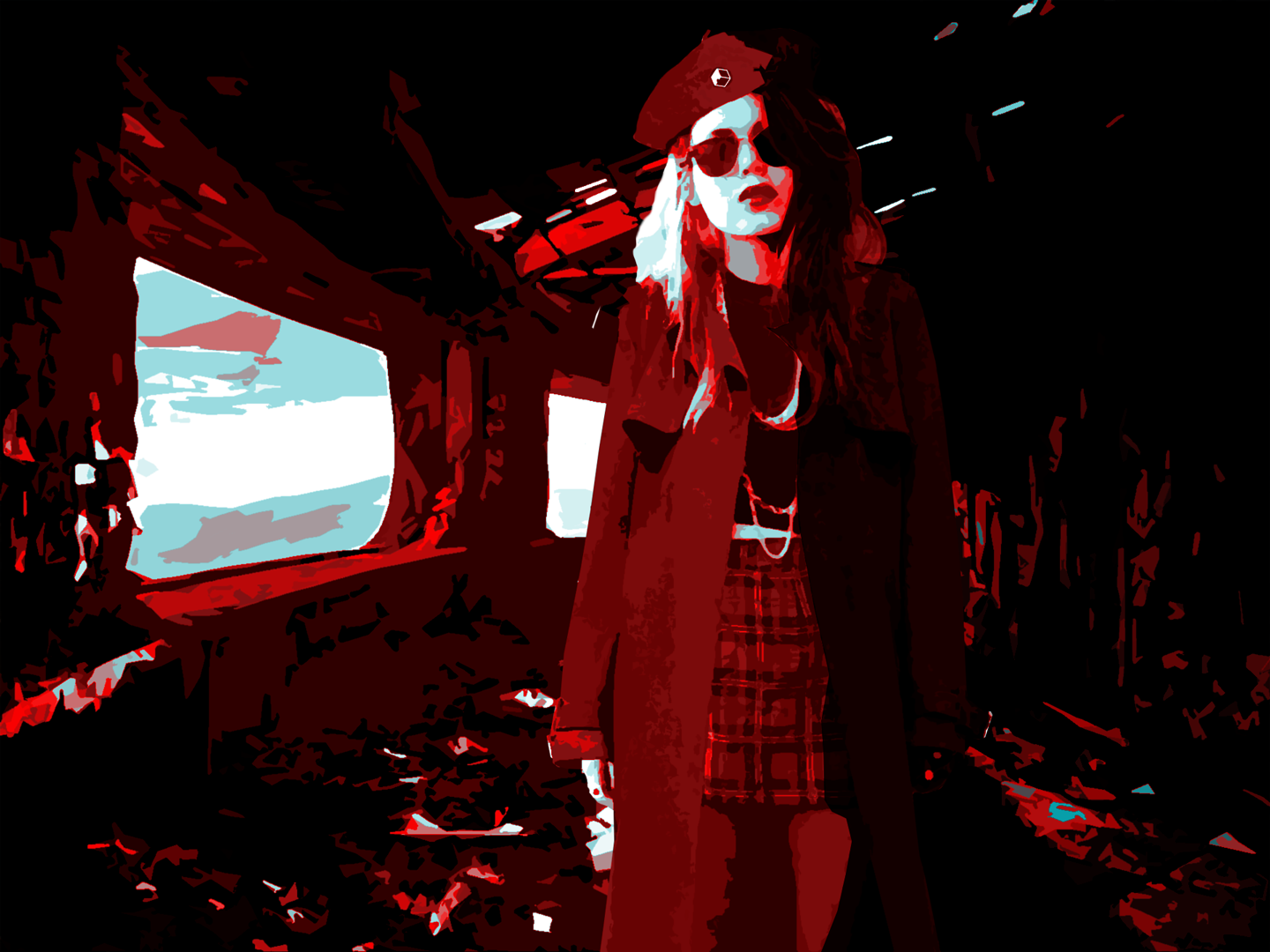
Introducing the games master character
Finally I introduced my first female games master character into the image to overlay the background and treated her with a similar set of filters as described above as well as adding some of my own shadows and lighting to have her sit better within the environment. To make the subject stand out more over the background I was more sensitive with the levels on the artistic cutout filter so that the treatment of the figure is a little less vectorised.
Tying this to my project
As a starting point I’m pretty pleased with the style of this image. There is definitely room for improvement as to an experienced Photoshop artist this image does look a little amateur and overly reliant on filters, however in favour of getting an end-to-end prototype of my game completed by the end of the study block I’ll use this technique to create all the visuals to drive my narrative throughout gameplay and then revisit the treatment of the artwork later as the app evolves through play testing. Whatever technique I settle upon, I need to be mindful that though initially my narrative will be delivered by static images of the games master, later my intention is for the statics to be replaced by rotoscoped video or animation and if I decide to go down the path of rotoscoping then the technique I use would preferably need to be less time consuming as I’ll be required to treat every frame in the same fashion.