Improving the on-boarding journey
Having worked daily on Escape The App for four weeks since building the first version of the on-boarding experience and adding the animated introduction video that I first previewed in this post, and seeing this same experience countless times during testing, I was starting to see some minor issues with the animation itself, but more importantly I was questioning the relevance of the animation within the journey for an existing returning user who’s login has been persisted on the device (I’m doing this currently with Firebase Authentication). And additionally, for new users I felt that after registering the user was not really given any direction with regard to what they should do next, and that any engagement I’d achieved in the narrative with the animation was completely lost.
The user stories I’d implemented previously were as follows:
- Story 1: As a new user I want to see a full introduction to the application before I make the decision to register so that I know what I am registering for.
- Story 2: As a returning logged in user I want to see a full introduction to the application with a skip button so that I don’t have to watch it again if I don’t want to.
- Story 3: As a new user, after I have registered I want to be taken to my personalised landing screen where I can see some suggested games so that I can play them.
- Story 4: As an existing user, after I have logged in I want to be taken to my personalised landing screen where I can see some suggested games so that I can play them.
I was beginning to feel like story one was still relevant but story two was not really delivering the best user experience, and upon repetitive testing stories three and four had some relevance but there needed to be a more clear Call To Action (CTA) for the user before they are taken to their landing screen after being registered or logged in. After previewing the app to a handful of colleagues and simulating the experience of both a new and returning logged in user, it was observed in the later that every single user hit skip almost immediately and the consensus from questioning was that the animation should in fact not be shown again if the user is still logged in. There was also a feeling amongst the majority of testers that the introduction was a bit pointless and that it was added for the sake of it.
The solution
I looked at some other app examples for inspiration including the team engagement gamification app Totem created by Play which I had downloaded recently for research purposes and remembered they had a good on-boarding experience (it’s worth mentioning that the founder of Play was previously at EA Games so their design approach is very game led). I then went back to the drawing board and arrived at the following user journey’s which I felt were much more engaging and which in my opinion would solve the above issues:
- Story 1: As a new user I want to see a full introduction to the application before I make the decision to register so that I know what I am registering for.
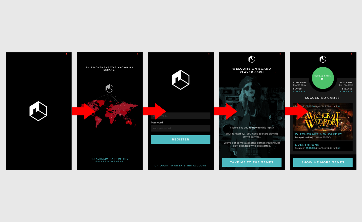
- Story 2: As a new user, once I have successfully registered I want to see a welcome message that has a clear CTA so I know what to do next.
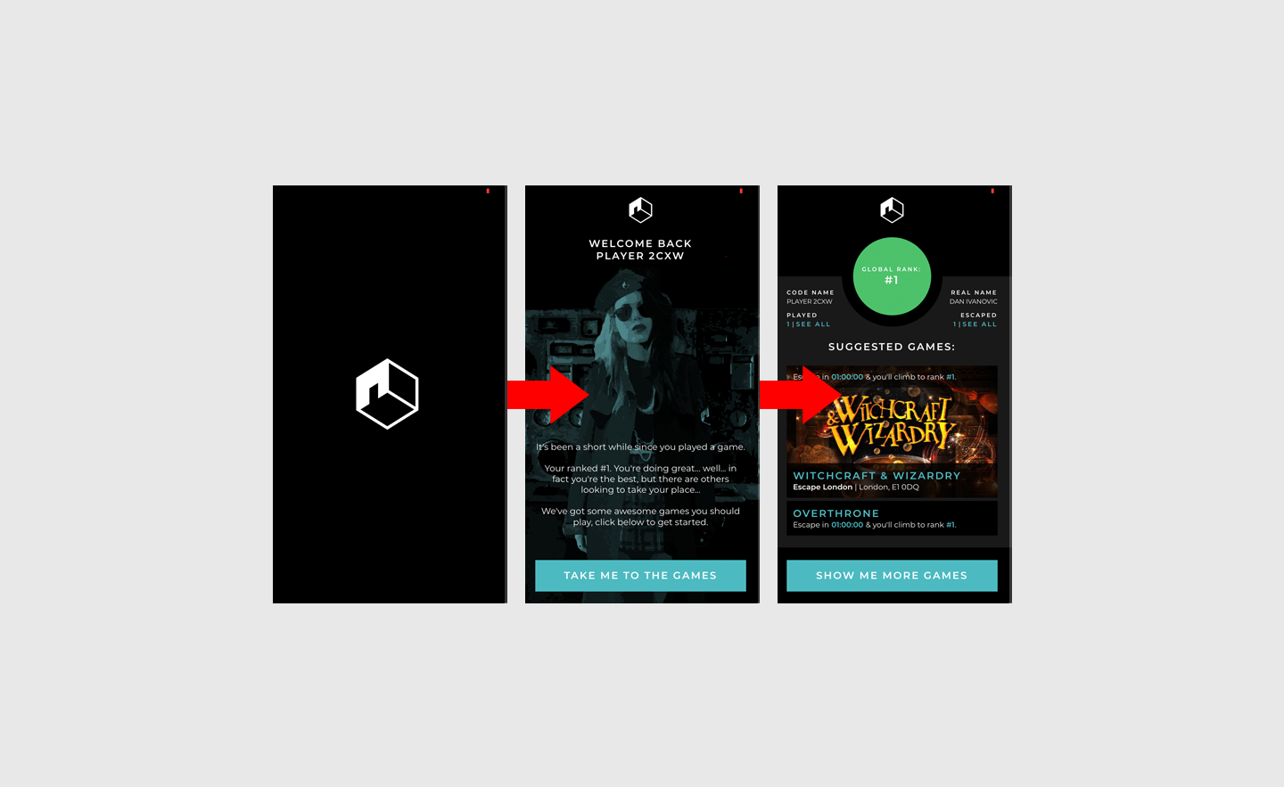
- Story 3: As a returning logged in user I do not want to see any introduction so that I can get into my account more quickly.
- Story 4: As a returning logged in user I want to see a welcome message that has a clear CTA so I know what has happened since I last visited and what I should do next.
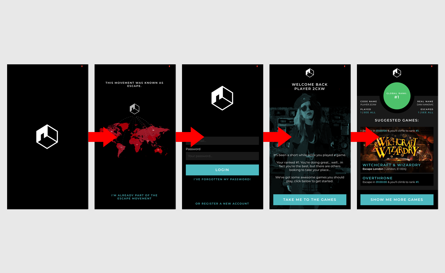
- Story 5: As a returning logged out user I want to see a full introduction to the application with a skip button so that I don’t have to watch it again if I don’t want to.
- Story 6: As a returning logged out user, once I have successfully logged in I want to see a welcome message that has a clear CTA so I know what has happened since I last visited and what I should do next.
I worked up some new UX and designs to satisfy these stories which can be seen below and I’ve created a ticket into the backlog on Trello here to implement these into the app:
Journey for a new user:

Splash -> Introduction -> Registration -> Welcome -> Landing
Journey for a returning logged out user:

Splash -> Introduction -> Login -> Welcome -> Landing
Journey for a returning logged in user:

Splash -> Welcome -> Landing
Summary
In this post I’ve highlighted a number of issues I’d identified with my app’s existing on-boarding experience and I’ve noted how I set about confirming my suspicions with some focused user testing. I’ve then outlined how I’ve set about fixing these issues drawing upon inspiration from another app that I’d used recently and I’ve created new designs to illustrate the new user journey’s required.