Colour theory
My experience in week four
The source material this week was focused on colour theory and prompted us to think a bit more about what colours we use and why we use them.
The Introduction Video by Alcwyn Parker sets the premise for a week that aims to be as colourful as possible and highlighted for us some of the areas we would be investigating such as the nature of colour, the human factors involved with colour perception, and colour theory, to help us make informed colour choices and speed up our design process. The video starts with a theoretical summary of colour and the way we perceive it and the importance of how we use it. There is a brief section on the differing meaning and acceptance of the same colours across cultures and the suggestion that colour is used to provoke emotion but that it is important to ensure we provoke the right emotions when using colour within our apps. I must say that none of this was new to me and having schooled in fine art and graphic design this served only to reiterate information that has pretty much become part of my subconscious by now. Saying this I was very interested to hear in the closing part of the video that Apple provide guidelines in how to use colour, I wasn’t aware of this. Though again the points they raise seem with my experience to be second nature and almost common sense I enjoyed knowing they’d taken the time to provide such succinct guidelines.
The Colour Theory Video by Alcwyn Parker expands on the introduction to give more scientific and theoretical insight into colour, from the physical properties of light, to the language and culture that form our understanding of colour. The video opens with a section on the science behind colour theory which I found to be very interesting, and I enjoyed learning more about the role of light in the portrayal of colour and how our perception of colour is based on the light that reflects off of an object. There is a section about colour modes with a description of both CMYK and RGB, both of which I am close too being I have a lot of experience in using both having traversed from print to digital design earlier in my career. There is then some detail on how a pixel works which I found to be eye opening and which filled some obvious gaps in my knowledge on how the screen produces colour using a red, green and blue light source. I found myself pondering how I’d not questioned this before being I’ve such long experience using RBG colours and having known the result had something to do with the screen being backlit. The video then moves to take a more theoretical stance, there is a section on colour interpretation that raises our awareness of International Klein Blue (IKB), a deep blue hue first mixed by the French artist Yves Klein who had a fascination with colour and explored the cultural impact on colour and theorised that appreciation of colour is a subjective experience that is unique to the individual. This section goes on to look at Hue, Saturation and Brightness (HSB) or as it can be know Hue, Saturation and Lightness (HSL) for which I’ve had some in-depth experience only recently when implementing custom HSL sliders in one of my applications Plays to control the colour of text and pattern graphics. Next there is an introduction to the Munsell colour system invented by Albert Henry Munsell who also had a fascination with colour but this time how we communicate, notate and document colour. I found this excerpt very interesting, I’ve lots of experience working with all aspects of colour in my design but I’d never come across the Munsell colour system nor the name of it’s creator. Next there is a section about the colour wheel and some theory behind the different types of relationships including complimentary, near complimentary, double complimentary, split complimentary, triad, analogous and mutual complimentary which prompts one of the weeks activities to produce our own wheel. And finally there is a section about Josef Albers and his book ‘Interaction of Colour’ which introduces us to TODO and prompts a second task to create our own colour palettes from different environments surrounding us which can be seen in more detail in this post.
Tying this to my project
Ahead of this weeks study I had already made decisions about the colours I would use in Escape The App and these have already been fed into the designs. As I’ve suggested earlier in this post my decision process when selecting my colour palette for my designs today has become almost subconscious and at first I thought this to be true in how I arrived at this palette. However, upon reflection I can recall the main drivers for using these colours and I’ve noted these within the graphic below.
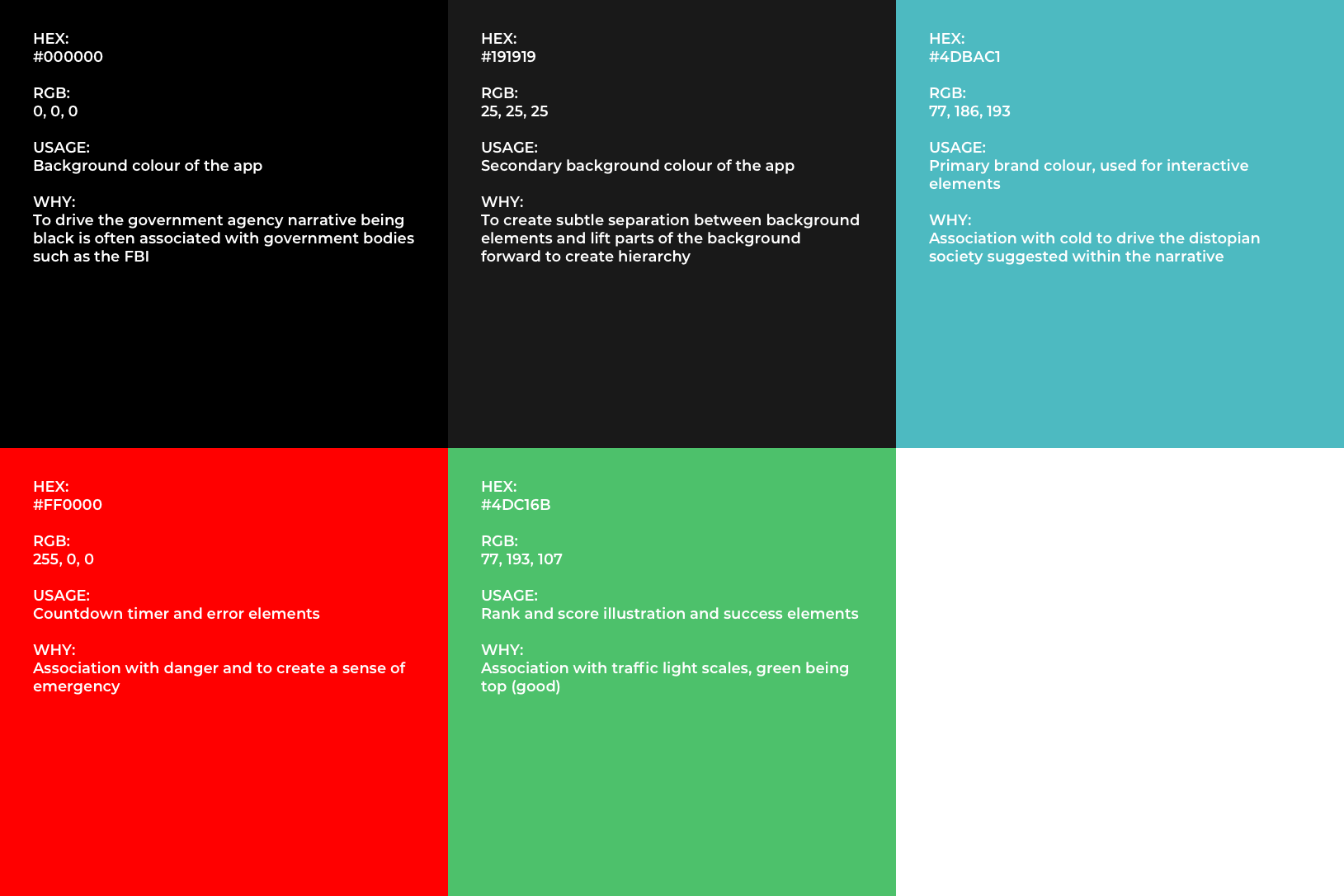
In light of undertaking the colour palette task this week and learning of Apple’s guides to colour selection, I thought it would be interesting for me to explore the palette I’ve chosen and see the relationships between the colours I’ve chosen to see if they adhere to Apple’s suggested best practice.
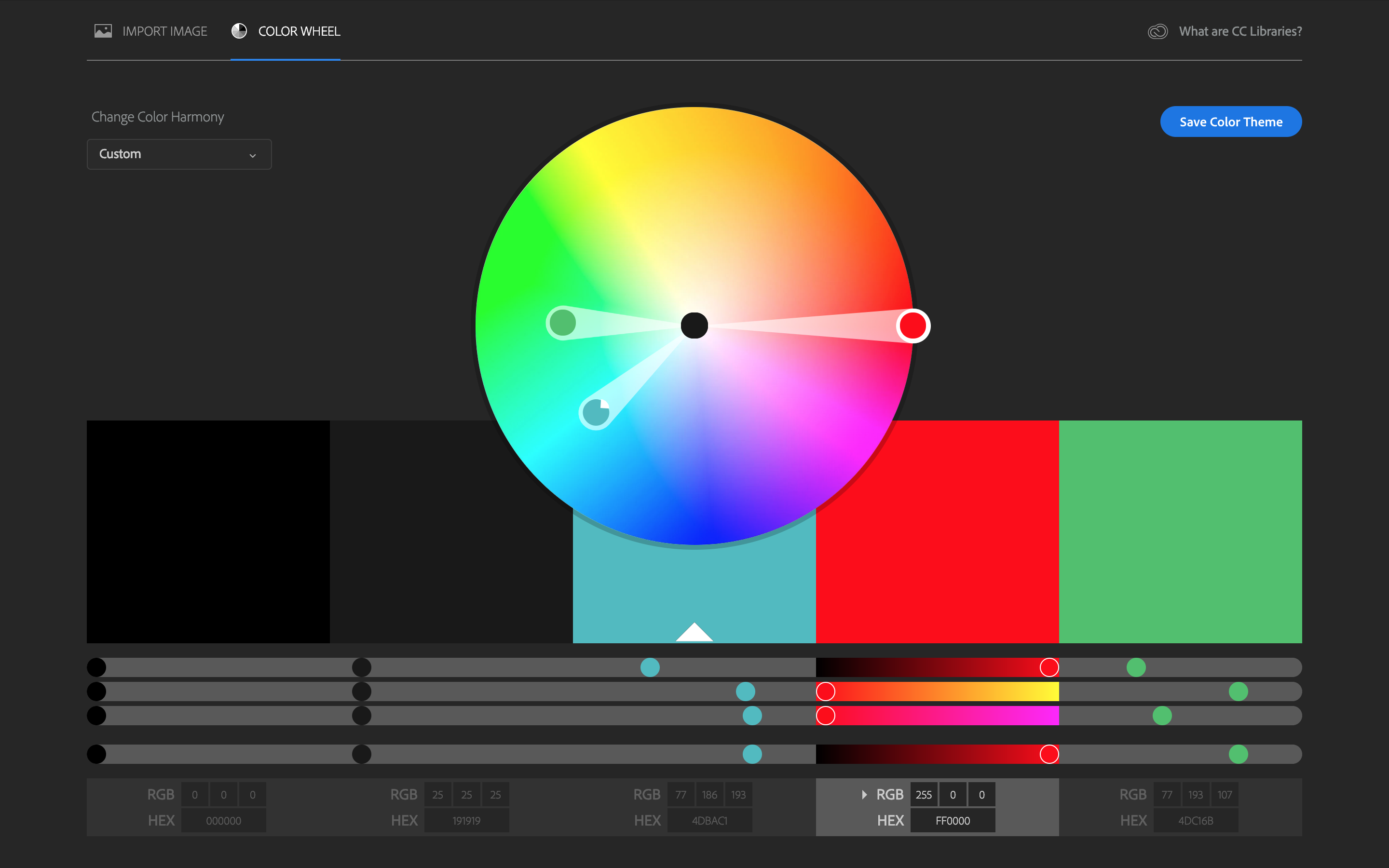
Apple suggests we use complementary colours throughout our apps. You can see that the red and the green I’ve selected are almost perfectly complimentary which is good being they will be used side by side to indicate success and failure so there needs to be a clear separation between the two. Both are highly vibrant and well saturated (especially the red) that is 100% saturated on Munsell’s chroma scale. The red and the blue (which is the colour I’d selected for interactive elements, again adhering to Apple’s suggestion that we should consider choosing a key colour to indicate interactivity throughout your app) are near complimentary which is good being these will be used side by side during game play, the red being used to indicate the countdown timer and the blue for the complete game Call To Action (CTA). In contrast the green and the blue are quite similar tonally which means they will sit well together but from a communication point of view these colours when used side by side will not separate well so I should bear in mind when constructing my designs that the two should never be layered on top of one another.
Summary
In this post I’ve given a brief summary of the source material from Canvas this week. I’ve noted the information I’ve found to be new and most of interest. Finally I’ve looked at the colour palette I had pre-selected for Escape The App and I’ve stress tested it against some of the theory I’ve learned over the week and critiqued to ensure that the palette adheres to Apple’s suggestions of best practice.