Revising the narrative delivery
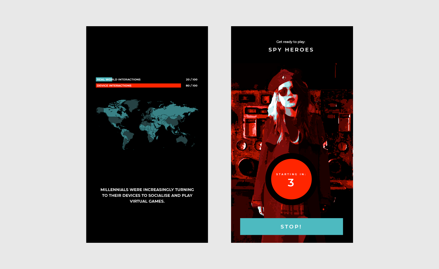
I wasn’t completely satisfied with the art in this post as the visual solution for delivering my narrative throughout game play. As a standalone piece of art the style worked as a temporary solution but once I brought the art into my application to sit behind one of the narrative screens that counts down to starting a game I found the visual to be quite jarring and the style did not work well with the clean and minimal look used in the rest of the app. Take for instance this example of the new countdown screen art aside a slide from the existing introduction sequence:
Initially I thought this could be a problem with the colouring, being that the red is only being used thus far to highlight errors and urgency, so in an effort to make the art sit better in the app I overlaid the background image with the brand blue. This works to a degree as you can see below, but something still feels slightly off.
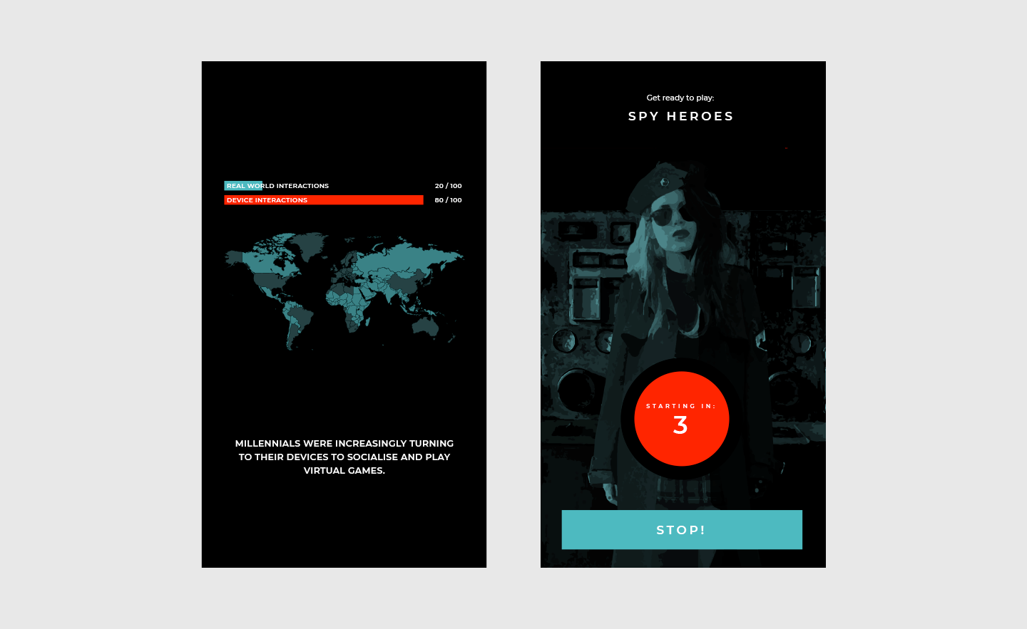
It’s at this point that I needed to take a step back from this. Drawing on my experience, I’d been in similar situations to this before when wrestling to bring artwork into an established design and having wasted a lot of time in trying when really there was something more fundamentally opposed between the two visual directions and they were never going to work together. I felt that I’d found myself here again; the existing design of Escape The App is vector driven, simplistic and minimal, there is purposely no photography in the visuals because the design needs to inhabit the differing themed imagery of the escape games for which I cannot control. Despite being doctored to appear vectorised the new artwork is still based on photo real imagery so it’s quite a departure from the current design.
The solution
I started looking around at how other games had delivered their narrative which led me to a few various examples, all of which were character driven and akin to where I had arrived. I started to consider creating a vectorised representation of the character that was more simplistic and in keeping with the rest of the design but it didn’t feel on point with the narrative; Escape is now an underground movement and using a vectorised character to depict this felt unrealistic.
For more inspiration and to get back in touch with the narrative I started going over my previous posts, reading this post reminded me of Sean Vanaman’s Firewatch Game and how they had used a voice over a walkie-talkie to drive the narrative. At the time I was inspired by the idea of doing something similar and being reminded of this set me on a new course. I started drawing on the escape games I had played, all of them have some way for the games master to communicate with the players but in none do you see the games master. With this in mind I started to explore communication devices. I eventually settled on creating a stylised and simplistic version of an intercom system which you can see sits much better beside the same slide from the introduction sequence:
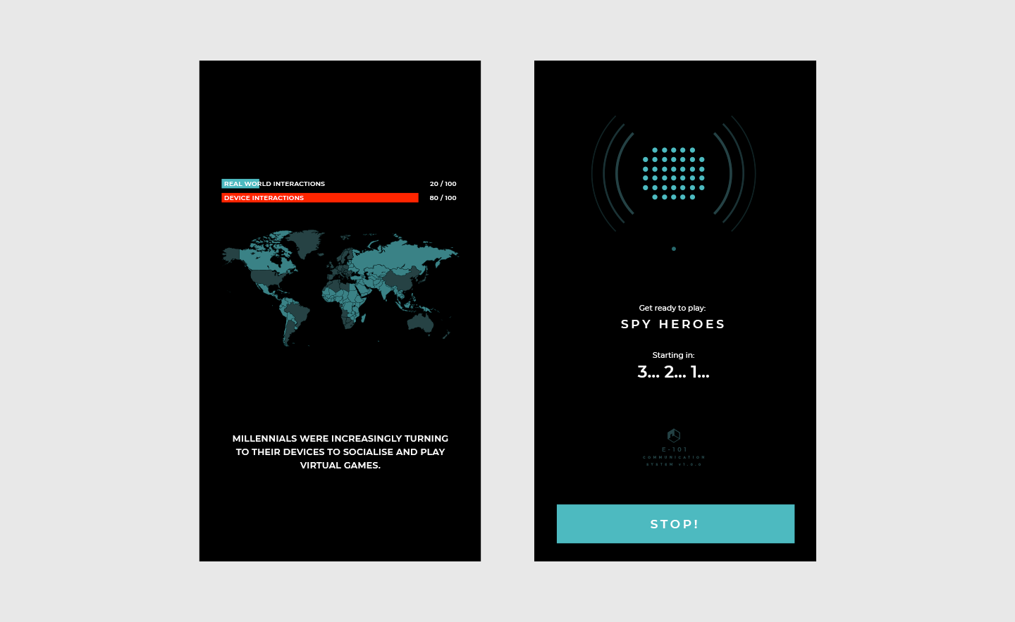
I felt this was a better solution all round. The design is more in keeping with the existing creative and when considering the execution, rather than being flat like the previous image, there is scope to animate the sound waves coming from the speaker in a diegetic manor to illustrate when the games master is speaking and for the message to type out as if it were a computer representing the spoken word using sound recognition. I’m much happier with this, but on reflection finding myself in this hole was a bit of a schoolboy mistake and probably due to the lesser amount I’m practicing design these days. To ensure I don’t make this same mistake again I need to keep the brand and the creative direction in mind and be more conscious of the design limitations when visualising new elements.
Summary
In this post I’ve established that the artwork I was using to drive my narrative wasn’t working with the rest of my apps design. I’ve dissected this to determine why and I’ve devised a new solution that is visually more in keeping with the creative and more on point with my narrative. I’ve created a ticket to develop this new solution in the app here on Trello.