Testing the gameplay experience
Being I reached the end of this week with a near end-to-end first version of the gameplay experience, I decided it was a good time to bring some user testing into scope to get some feedback to improve parts of this feature ahead of my submission in three weeks. As I touched on in this post about developing the gameplay journeys there are two types of game, I will list these with definitions below:
- Unsubscribed games: These are games that are manually added into the app or scraped. These games comprise of basic public data that is easily obtainable online such as the time allowed to escape the game and the minimum and maximum number of players. An unsubscribed game can be played but the experience is stripped down to allow the player to record their escape time and save it but there will be no clues available.
- Subscribed games: These are unsubscribed games that have been enriched with their rooms and the clues in each room by the game owners. A subscribed game can be played with all the same functionality as an unsubscribed game but in this case the user is given advice about their progress throughout a game, and the clues that were added are made available at the time stated upon entry. Once a clue has been made available it can be taken immediately or it can be taken later from within the available clues dialog. Taking a clue carries an optional time penalty that can be added by the game owner.
The focus of this user testing was to test both these types of game with a handful of users and observe how they interact with each game and then conduct a short informal interview afterwards to get feedback so that I could then make steps to improve the games in certain areas.
I’ve documented the complete results of the test here but to summarise here are some of the key takeaways accompanied by my suggestions to remedy the problem areas:
The countdown screen
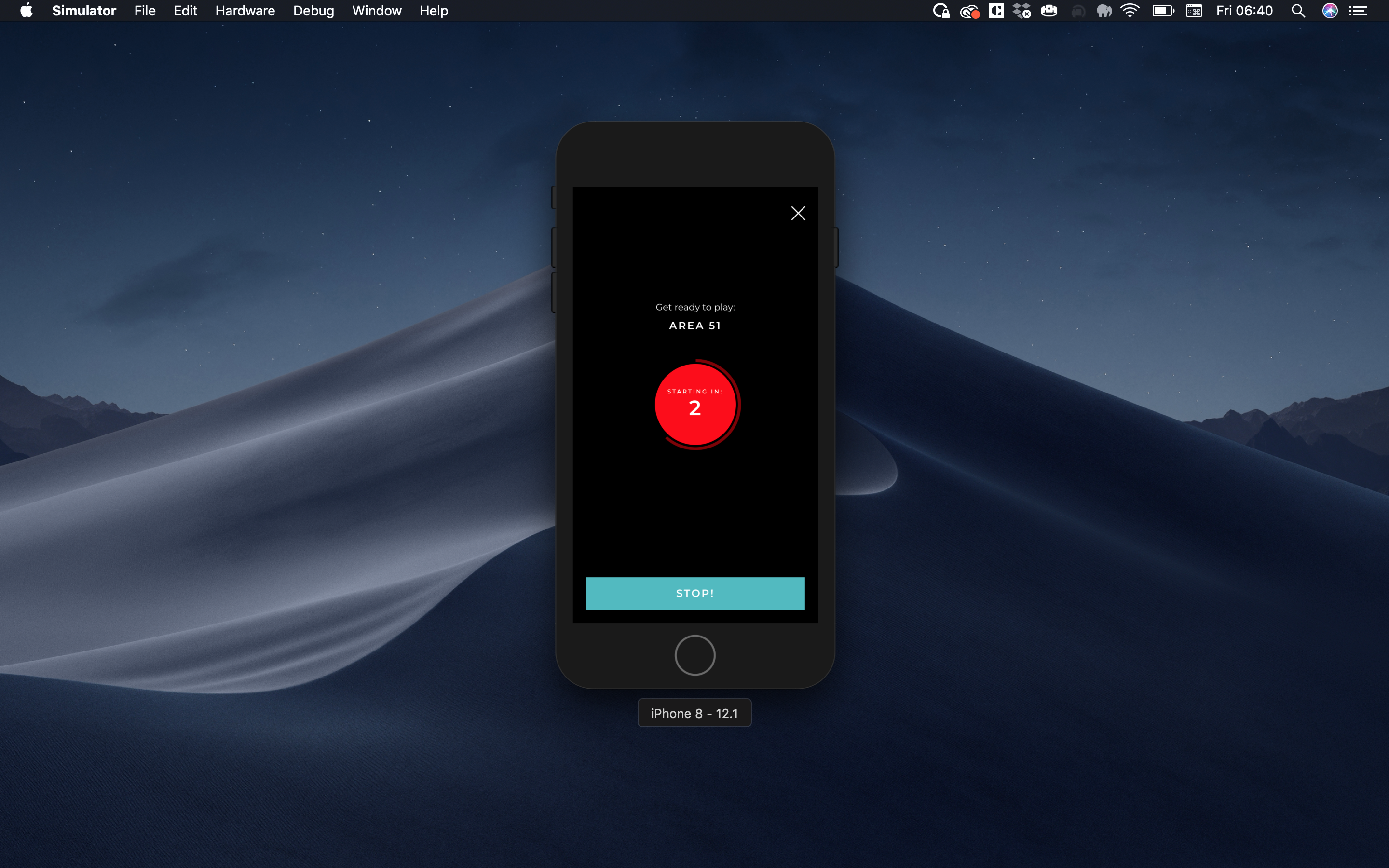
Observation / feedback: One test subject instinctively clicked the ‘Stop’ button on the countdown timer screen to stop the game from starting. On questioned why he did this after the test was complete, the subject suggested this was because the button was quite prominent and he thought it was the required thing to do to start the game immediately without waiting for the countdown to complete.
Solution: In my opinion the issue with the ‘Stop’ button is that it has the same styling as a main CTA button. From a design language point of view all buttons that look like this in the app instigate the most intuitive action. In the case of a confirmation scenario in the app the main CTA will confirm and there is a secondary CTA beneath this to cancel. One solution to this problem is to make this button a main CTA with the label ‘Start the game already!’ (or similar) and give it the positive outcome the user was looking for, and then add a secondary CTA beneath the main CTA which reads ‘Cancel’ that is more consistent with the language used everywhere else in a confirm or cancel scenario. I’ve created a ticket on Trello here to address this issue.
Playing an unsubscribed game
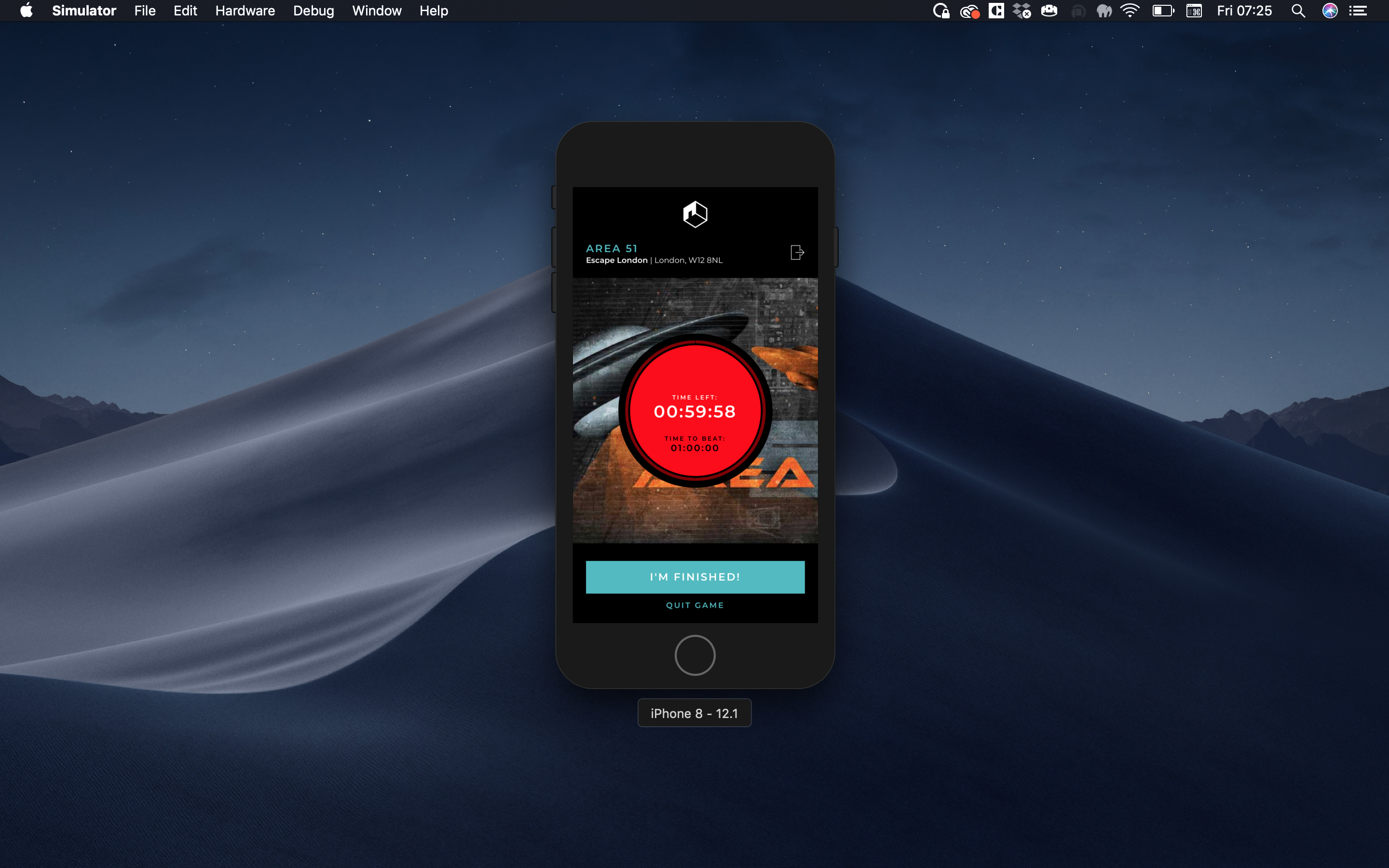
Observation / feedback: All subjects paused for a while once the game had begun and then started looking for what they should do next. One test subject handed the phone back as if the test had finished. When question on this afterwards the consensus was that they were a bit confused about what they were supposed to do next. When I told the subjects that they could have locked the phone and played the game while the timer ran down in their pocket they said that this was not clear.
Solution: In my opinion this issue is related to the lack of messaging and this is not isolated to only unsubscribed games; it’s not abundantly clear what the purpose of the gameplay element is to a user who has not used the feature before. Also for users that have used the feature it’s not clear what the difference is between a subscribed and an unsubscribed game. After much thought I don’t think I need to go as far as explaining what unsubscribed and subscribed games are because the user probably doesn’t care and this will likely confuse them, what is important though is that the user knows what to do next when they start a game no matter the type, and this is what I need to remedy. After some thought I feel that the best solution to resolve this is to have a message delivered by the games master that informs the user what their mission is even before the game countdown. So the new story we have is:
As a user, when I click to play a game I need to be told what the purpose of the game is so that when the game starts I know what to do.
And the new journey would be:
Click to play game -> Game Purpose -> Game Countdown -> Game
With regard to the messaging we would have something like the following:
You’re about to play
{GAME-NAME}, once the game starts you can lock your device and put it in your pocket, you’ll have{TIME-ALLOWED}to escape this game and we’ll tell you when you’re running low. When you’ve escaped click ‘I’m Finished’ and we’ll save your result. Good luck{PLAYER-CODE-NAME}.
I’ve created a ticket on Trello to implement the new ‘Game Purpose’ step here.
Playing a subscribed game
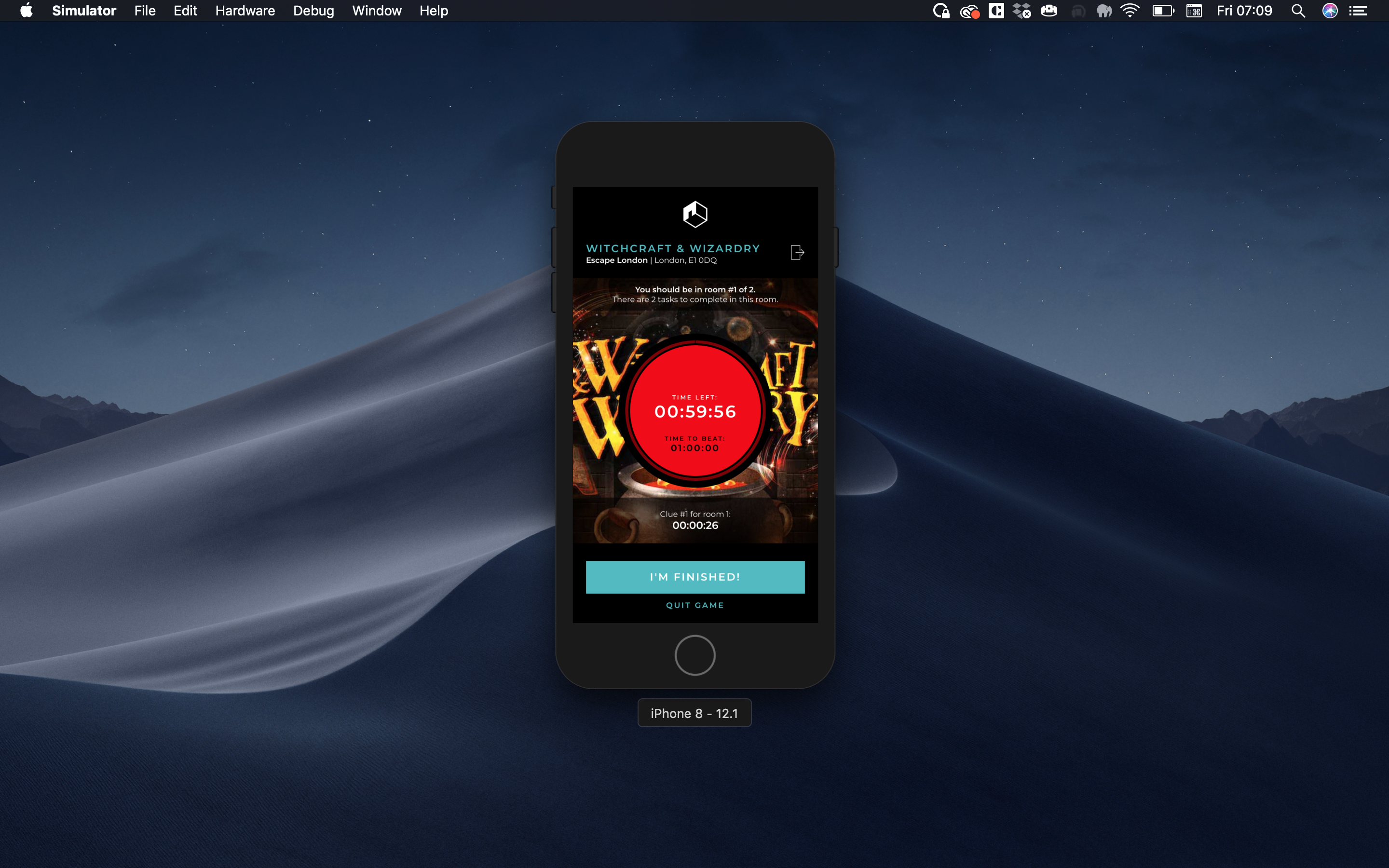
Observation / feedback: All subjects paused for a while once the game had started and all of them waited while watching the countdown to the first available clue (30 seconds in this test). When questioned all subjects suggested that it was more clear what was going on now with the subscribed game being that they could see the countdown to the clues on screen so they knew what was coming next. The problem here is that I don’t want the users to stare at their device after the game has started and until the first clue is available, I want them to acknowledge that a clue will be coming soon and then nest the device promptly so they can play the game.
Solution: In my opinion this issue is again related to the lack of messaging. Though the above solution will help users to understand the purpose of a game, I will need some additional messaging to educate users on the number of clues available and how these will be given to the user. I could squeeze this into the above ‘Game Purpose’ step but the copy would become quite heavy and it would be a lot to take in. After some thought I concluded that a better solution would be to have another step shown for subscribed games in between the ‘Game Purpose’ and ‘Game Countdown’ steps. So the new story we have is:
As a user, when I click to play a game, after I’ve been told what the purpose of the game is, if there are clues in the game I need to be told how these will be given so I know when one is available to be taken.
And the new journey would be:
Click to play game -> Game Purpose -> Game Clue Advice -> Game Countdown -> Game
With regard to the messaging we would have something like the following:
There are
{NUMBER-OF-CLUES}clues in{GAME-NAME}. When you hear the following soundCTA-TO-PLAY-SOUNDyou’ll know there’s a new clue available. Clues can be taken immediately or at any time after they’ve been made available by clicking ‘See all clues’.
I’ve created a ticket on Trello to implement the new ‘Game Clue Advice’ step here.
Conclusion
The results from this round of user testing have presented some clear gaps in the gameplay experience. There are some smaller issues not mentioned in this post for which I’ve created tickets but in the most part the main issues surround lack of messaging which is causing a poor and confusing user experience. I’ve devised solutions for these which in my opinion seem credible, but I do have some reservations when it comes to overloading the user with messaging before a game and whether this itself will create a poor user experience. However in adopting the iterative method to development I am going to develop these changes as quickly as possible so that I can conduct another round of user testing with the same test subjects and gauge whether my solutions have fixed these problems or created new problems based on their feedback.
Summary
In this post I’ve summarised the results of my first user test of the gameplay element within Escape The App. I’ve detailed where the testing has identified gaps in the experience and where improvement is required along with some analysis and some potential solutions. I’ve concluded by adding tickets on Trello to implement all the adjustments which I will complete before conducting a second round of user testing with the same test subjects.